What to Wear So Your Photos Feel Like a Dream: A Color Cheat Sheet for Real Families
Every week, without fail, I get the same text: "Izzie, what should we WEAR?" And every week, I get genuinely excited to answer, because outfit colors are the single easiest way to level up your gallery — no new camera, no fancy location required.
So I'm putting it all here. Consider this your cheat sheet, your permission slip, and your gentle intervention all in one.
First, a Quick Word on How Light Behaves
My style leans soft, airy, and a little bit romantic — lots of golden light, gentle tones, images that feel like a memory. Natural light doesn't just photograph you; it photographs your clothes too. Certain colors drink up that light and glow. Others bounce it around like a pinball machine. Knowing the difference is 90% of the game.
The 7 Palettes That Always Deliver
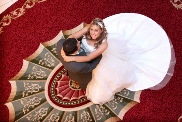
1. Cream, oatmeal, and warm white. The undisputed champion. These tones reflect light beautifully onto your face — basically a free softbox. They work on every skin tone and every season.
2. Sage and olive green. If you've ever wondered why so many of my galleries feel like a Pinterest board, this is why. Sage melts into outdoor settings without disappearing, and it flatters literally everyone.
3. Dusty blue and slate. Cool but not cold. Dusty blue is stunning at the beach, in a field, or against autumn trees. It reads calm and timeless.
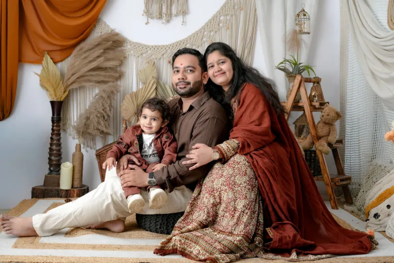
4. Terracotta and rust. The fall MVP. Rust tones against amber leaves or golden grass? Chef's kiss. And it makes blue and green eyes absolutely pop.
5. Soft blush and mauve. Romantic without being precious. Blush photographs about two shades softer than it looks in real life, so don't be shy with it.
6. Butter yellow. Having a serious moment right now, and honestly, it earned it. Butter yellow in late-spring light is pure happiness in photo form.
7. Earthy neutrals — camel, tan, chocolate. The glue that holds a family's outfits together. If everyone anchors in neutrals, you can add one accent color and it all just works.
The 3 That Fight the Camera
1. Neon everything. I love your enthusiasm, but hot pink and electric green don't just photograph bright — they glow and cast color onto your skin and everyone near you. Neon yellow-green is the worst offender. Your face will literally look greenish. Trust me.
2. Tiny stripes and micro-checks. Cameras and fine patterns don't get along. They create a weird shimmering distortion called moiré (yes, it has a name, and yes, it's as annoying as it sounds). Go with a chunky stripe or a solid instead.
3. Pure, stark black in bright sunlight. Black absorbs every photon of light in sight, which means your face loses detail while your shirt stays a dark void. If you love black, soften it — charcoal, or black paired with light neutrals.
Coordinating Without Going Matchy-Matchy
Please, I'm begging you: no matching khaki-and-white polo uniforms. The goal is harmony, not twins.
Here's the formula I give every family: pick a palette of three or four colors from the list above, assign them loosely across everyone, and vary the textures. Linen next to knit next to denim. One person in a pattern (keep it subtle), everyone else in solids pulled from that pattern. Done.
And one final note — dress for the season you're in, not the one on the calendar. A cozy sweater session in October is dreamy. A sweater session in July in Georgia is a sweat-fest, and no color palette fixes sweat.
Still stuck? Send me a photo of your outfit spread on the bed. I will absolutely tell you the truth. It's kind of my favorite part of the job.